


Product discovery is where Shopify design either earns revenue or quietly leaks it. A shopper may arrive with a clear need, a vague preference or only a problem to solve. If the store cannot quickly translate that intent into relevant products, the best product detail page in the world will not get enough qualified traffic.
That is why strong Shopify website design services should go beyond visual polish. They should shape how shoppers browse, search, filter, compare and move from one product to the next. The goal is not simply to make a store look premium. The goal is to help customers find the right product with less effort and more confidence.
For retail teams, this is a practical growth lever. Better discovery can support conversion, average order value, inventory movement and customer satisfaction at the same time. It also gives merchandisers a cleaner system for promoting the right products without relying on guesswork or one-off homepage changes.
Product discovery is a design problem, not just a search problem
Many Shopify stores treat discovery as a theme feature: add a menu, install a search app, create collections and move on. That is rarely enough for a growing retail brand.
Discovery is the full path between shopper intent and product confidence. It includes category labels, navigation depth, collection sorting, search behavior, filters, product cards, imagery, recommendations, content and performance. Each layer either reduces cognitive effort or adds friction.
A shopper looking for “black waterproof boots for winter travel” might enter through organic search, a paid landing page, a homepage menu or the site search bar. A discovery-focused design system makes that journey feel consistent across all entry points. The same product attributes, language and merchandising logic should appear wherever the shopper starts.
This is where Shopify website design services become more strategic. A design partner should understand retail behavior, Shopify’s theme and data constraints, the brand’s merchandising model and the operational reality of keeping product data clean over time.
Start with shopper intent and product taxonomy
Product discovery depends on structure. Before redesigning menus or collection pages, retail teams need to understand how customers actually think about the assortment.
Internal teams often organize products around buying, manufacturing or inventory categories. Customers usually organize products around use cases, style, fit, occasion, problem, price, material or compatibility. If the storefront mirrors internal logic too closely, shoppers may not know where to go.
A better taxonomy starts with questions such as:
- What language do customers use in search, reviews and support tickets?
- Which product attributes meaningfully affect purchase decisions?
- Which categories need guided browsing instead of broad grids?
- Where do shoppers need education before they can choose?
- Which products are substitutes, upgrades or complements?
For example, an apparel brand may need discovery paths by gender, fit, activity, fabric and weather. A beauty brand may need paths by skin type, concern, ingredient preference and routine step. A home goods brand may need paths by room, material, size and design style.
The design work is then built around that taxonomy. Navigation, filters, collection tiles, badges and product cards all pull from the same decision logic. This keeps the experience coherent and makes ongoing merchandising easier.
Design navigation for the way people browse
Navigation is often the first visible expression of product discovery. A clean header is important, but clarity matters more than minimalism.
A strong Shopify navigation system gives shoppers enough direction without overwhelming them. Broad categories should be easy to scan. Subcategories should use familiar labels. High-intent links, such as best sellers, new arrivals, gift guides, sale or shop by need, should appear where they genuinely help decision making.
Mega menus can be useful for larger catalogs, but they should not become dumping grounds. The best ones prioritize high-value routes and make tradeoffs. If every link is treated as equally important, none of them are.
Mobile navigation deserves separate attention. A desktop mega menu cannot simply collapse into a long mobile drawer and still perform well. On mobile, shoppers need short paths, clear category hierarchy, thumb-friendly controls and visible ways to return or refine. Since mobile sessions often include more interruptions, the design has to help people regain context quickly.
If navigation issues are tied to deeper platform architecture, it may be worth reviewing what a Shopify website development company should build before treating the problem as a surface-level theme adjustment.
Make collection pages work harder
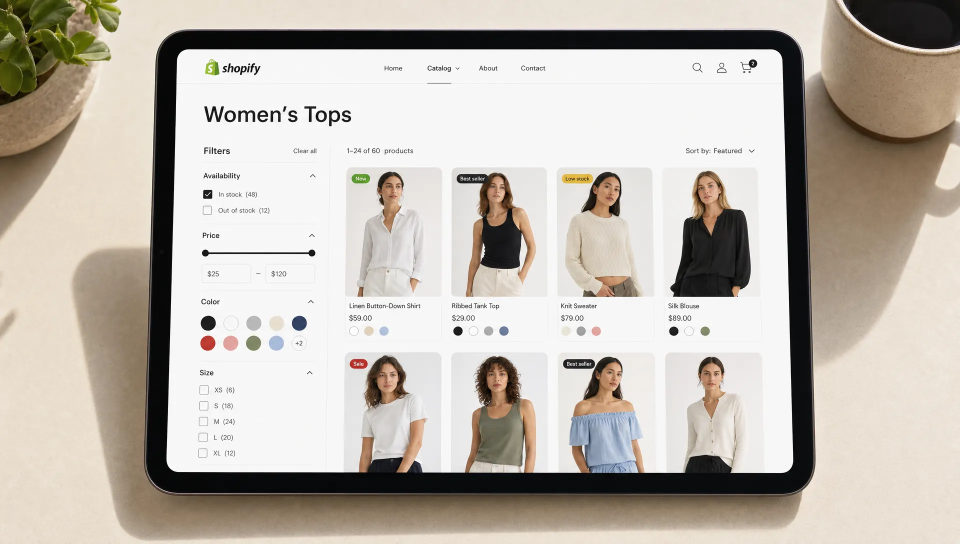
Collection pages are where discovery becomes commercial. They are not just product grids. They are merchandising surfaces that help shoppers narrow choices, understand differences and build confidence.
For many Shopify stores, collection pages receive significant traffic from search, email, paid campaigns and navigation. If they are generic, slow or hard to refine, shoppers bounce or choose based only on price and thumbnail appeal.
High-performing collection page design usually includes:
- Clear page headings and short context that explain the category
- Relevant filters based on real decision attributes
- Sorting options that match shopping behavior
- Product cards with enough information to compare items
- Merchandising zones for best sellers, bundles or seasonal edits
- Fast loading on mobile and desktop
Filters are especially important. Too few filters force shoppers to scan irrelevant products. Too many filters create analysis paralysis and maintenance problems. The right set depends on category behavior. A furniture category may need dimensions and material. A skincare category may need skin concern and product type. A grocery or CPG category may need dietary preferences, pack size and flavor.
| Discovery element | What it helps shoppers do | Common Shopify design mistake |
|---|---|---|
| Category taxonomy | Choose the right browsing path | Using internal product groupings instead of customer language |
| Filters and facets | Narrow a large assortment quickly | Adding generic filters that do not reflect purchase decisions |
| Product cards | Compare options before opening a product page | Showing only image, title and price for complex products |
| Search experience | Translate high-intent queries into relevant results | Treating zero-result searches as dead ends |
| Recommendations | Continue exploration across related products | Showing generic upsells that ignore context |
Improve product cards before redesigning every product page
Product cards are one of the most underused discovery tools on Shopify. They influence whether shoppers open a product page, compare alternatives or abandon the grid.
A basic product card may be enough for a simple catalog, but many retail categories need more information before the click. Depending on the assortment, product cards can show ratings, color swatches, variant availability, key benefits, size range, badges, price per unit, subscription eligibility or quick-add options.
The point is not to overload the card. It is to identify the information shoppers need before they commit attention to a product detail page. If customers repeatedly open and close several products because they cannot compare them from the grid, the collection experience is doing too little work.
Imagery also matters. Product photos carry much of the discovery burden, especially in fashion, beauty, home, food and lifestyle categories. Blurry thumbnails, inconsistent backgrounds or over-compressed images reduce trust and make products harder to compare. Teams that need a practical image workflow can use guidance on how to improve Shopify product image quality before images enter the storefront.
Treat site search as a high-intent journey
Site search users often know what they want, but that does not mean they will type the exact product name or category label. Search design has to account for synonyms, misspellings, product attributes, use cases and common customer language.
A useful Shopify search experience should support autocomplete, query suggestions, relevant product results, collection suggestions and content where appropriate. For a complex catalog, it may also need synonym management and merchandising rules so that important products surface for valuable queries.
Zero-result searches deserve special attention. A dead end communicates that the store cannot help, even when a relevant product may exist under different wording. Better patterns include suggested queries, related categories, popular products or a prompt to browse by need.
Search analytics can also reveal mismatches between customer intent and product structure. If shoppers search for “wide fit,” “refill,” “travel size” or “non toxic” but the catalog does not expose those attributes, the design team has found a discovery gap.
Use guided selling when shoppers need help choosing
Some purchases require more than browsing. If customers need to understand fit, compatibility, routine, bundle selection or technical specifications, guided selling can make discovery more useful.
Guided experiences can be simple. A quiz, a “shop by concern” page, a comparison table or a curated routine builder may be enough. The best format depends on the category and the level of customer uncertainty.
For example, a wellness brand might guide shoppers by goal and dietary preference. A furniture brand might guide by room size and style. An electronics accessories brand might guide by device compatibility. The design should not feel like a gimmick. It should reduce the number of decisions shoppers have to make before seeing relevant products.
AI-driven retail experiences can support this work when they are grounded in the brand’s product data and merchandising rules. Conversational commerce, product finders and recommendation logic are most useful when they respect inventory, margin, customer context and the shopper’s actual need.
Connect discovery with performance and Core Web Vitals
Discovery fails when pages feel slow. A shopper may tolerate a slight delay on a single product page, but browsing a collection requires repeated interactions: loading filters, scrolling products, opening product pages, returning to the grid and refining again.
Slow filtering, layout shifts, heavy scripts and oversized media all make discovery feel clumsy. This is especially damaging on mobile, where network conditions and device performance vary widely.
Good Shopify website design services should include performance thinking from the start. Design decisions affect image weight, app usage, JavaScript, font loading, section complexity and how quickly shoppers can interact with key pages. A visually impressive collection page that loads poorly is not a successful retail experience.
Performance work also supports operational stability. When a store depends on too many overlapping apps for filters, reviews, personalization, bundles and search, the frontend can become fragile. Reducing app sprawl and building cleaner integrations often improves both shopper experience and team efficiency.
Design recommendations around context, not generic upsells
Recommendations can help shoppers continue discovering products, but only when they feel relevant. Generic “you may also like” rows often underperform because they do not reflect the shopper’s current context.
Recommendation modules should be designed around intent. On a product page, shoppers may need alternatives, complementary items, bundles, replacement parts, routine steps or products from the same collection. In the cart, they may need accessories, refills or threshold-based additions that make sense with what they already selected.
The placement and label matter too. “Complete the routine,” “Pairs well with,” “Compare similar styles” and “Customers also viewed” each set different expectations. A discovery-focused design team chooses language based on how shoppers make decisions in that category.
This is also where merchandising strategy should influence technology. Automation can save time, but retail teams still need guardrails for inventory, margins, exclusions and brand priorities.
Measure discovery with the right KPIs
A discovery redesign should not be judged only by overall conversion rate. Conversion matters, but it may not explain whether shoppers are finding products more efficiently.
Retail teams should look at behavior across the discovery journey. Useful indicators include collection engagement, filter usage, search usage, zero-result searches, product card click-through rate, product detail page views per session, add-to-cart rate from collection pages, internal search conversion and revenue per search session.
No single metric tells the whole story. For example, fewer product detail page views can be positive if shoppers compare better from the collection grid. More filter usage can be positive if it leads to higher engagement, but negative if shoppers are struggling to narrow the assortment. The interpretation depends on the journey.
Analytics and KPI tracking should be part of the design service, not an afterthought. The team should define what success looks like before launch, then continue optimizing based on real customer behavior.
What to expect from a discovery-focused Shopify partner
The best Shopify website design services combine strategy, UX, engineering and merchandising knowledge. Product discovery is too connected to data structure, page speed and catalog operations to be solved by visuals alone.
A strong partner should be able to audit the current journey, identify where shoppers lose momentum and translate those findings into design and technical improvements. That may include restructuring collections, improving product templates, refining mobile navigation, reducing app complexity, enhancing search, creating guided selling tools or improving the analytics setup.
The partner should also know when not to redesign. Sometimes the fastest gains come from cleaning product data, simplifying filters, improving image consistency or changing collection merchandising rules. A good retail agency will separate cosmetic preferences from changes that improve customer behavior.
If your team is also evaluating broader conversion impact, Space Dinosaurs has written about how a Shopify website design company shapes conversion across the storefront, product pages, mobile experience and checkout flow.
A practical product discovery audit checklist
Before investing in a full redesign, review the current Shopify experience through the eyes of a shopper. Choose a few common purchase missions, then test how quickly someone can reach a confident decision.
Look for friction in these areas:
- Can shoppers understand the main categories within a few seconds?
- Do collection filters reflect the attributes customers actually care about?
- Do product cards show enough information to compare products?
- Does mobile navigation feel shorter and clearer than desktop navigation?
- Do search results handle common synonyms and partial queries?
- Are zero-result searches recovered with helpful alternatives?
- Do recommendations match the shopper’s current context?
- Are discovery pages fast enough for repeated browsing?
- Can merchandisers update discovery experiences without developer dependency for every change?
This kind of audit often reveals that product discovery is not broken in one place. It is usually weakened by several small issues that compound across the journey.
Frequently Asked Questions
What are Shopify website design services for product discovery? They are design, UX, merchandising and technical services that help shoppers find relevant products more easily. This can include navigation, taxonomy, collection pages, filters, search, product cards, recommendations, guided selling and performance improvements.
How is product discovery different from conversion rate optimization? Product discovery focuses on helping shoppers find and evaluate the right products. Conversion rate optimization focuses on reducing friction that prevents purchase. The two are connected, but discovery comes earlier in the journey and affects which products shoppers consider in the first place.
Do small Shopify stores need advanced product discovery? Smaller stores may not need complex filters or personalization, but they still need clear categories, strong product cards, good imagery, simple navigation and fast mobile browsing. Discovery should match catalog complexity.
Which Shopify pages matter most for product discovery? The homepage, navigation, collection pages, search results, product pages and cart recommendations all contribute. For larger catalogs, collection pages and search results often deserve the most attention because they handle the highest volume of comparison behavior.
How often should a Shopify store review product discovery? Review discovery whenever the catalog grows, customer behavior changes, major campaigns launch or search data shows recurring friction. For active retail brands, a quarterly review is a practical rhythm.
Build a Shopify experience that helps shoppers find what they came for
A beautiful Shopify store can still underperform if customers cannot find the right products quickly. Strong product discovery requires thoughtful taxonomy, clear UX, reliable performance, useful search, better merchandising and analytics that show where shoppers get stuck.
Space Dinosaurs helps retail brands modernize e-commerce experiences with AI-enabled engineering, human-centered UX design, performance optimization, analytics and ongoing improvement. If your Shopify store has a strong catalog but shoppers are not exploring it effectively, the discovery journey is a smart place to start.
To discuss how Shopify website design services can improve your retail experience, visit Space Dinosaurs and start with the paths your customers take before they buy.