

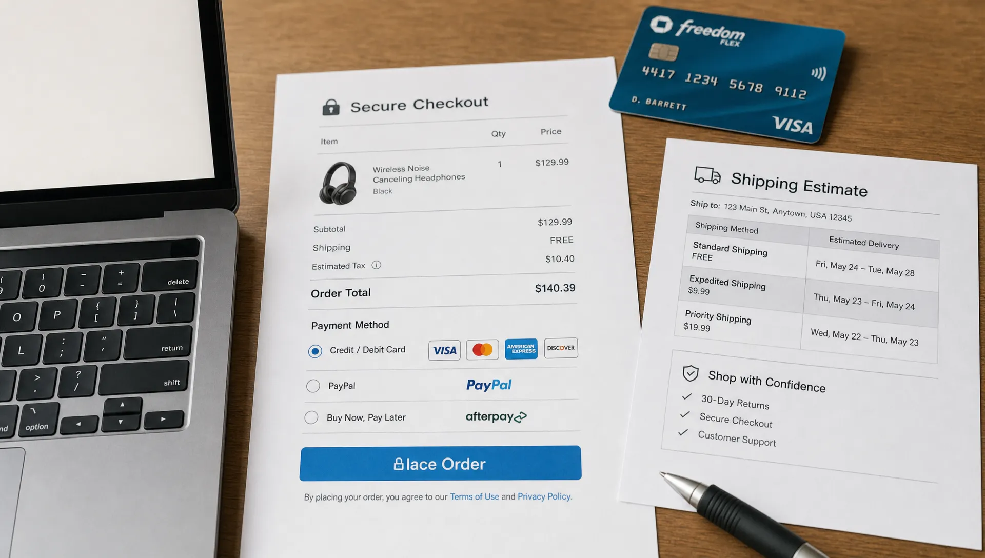
Cart abandonment is rarely a mystery once you look closely at the customer journey. Shoppers leave when the final steps feel slow, unclear, expensive or risky. For retail brands, checkout optimisation is the discipline of removing those last-mile barriers so more high-intent visitors complete the purchase they already decided to make.
The stakes are high because checkout sits at the narrowest point of the funnel. According to Baymard Institute’s cart abandonment research, the average documented online cart abandonment rate is close to 70%. Not every abandoned cart is recoverable, since some shoppers are comparing prices or saving items for later, but a meaningful share leaves because of fixable friction.
A practical checkout optimisation program does not begin with changing button colors. It starts by identifying where customers hesitate, what information they need to move forward and which technical issues interrupt a ready-to-buy moment.
Where checkout optimisation has the biggest revenue impact
Checkout is where commercial, technical and UX decisions collide. A promotion that is hard to apply, a shipping threshold that appears too late or a payment method that fails on mobile can undo all the work invested in merchandising, paid media and product detail pages.
The strongest gains usually come from three types of fixes. First, reduce cognitive load so the buyer always knows what to do next. Second, remove operational uncertainty around delivery, returns, taxes and fees. Third, make the experience fast and stable across the devices customers actually use.
For retailers, this is also a margin-friendly growth lever. Improving checkout completion can increase revenue without immediately turning to discounts, which is why it pairs well with broader work on improving conversion rate without discounting.
Start before the payment page
Many checkout failures begin in the cart. If shoppers cannot confirm product details, delivery expectations, promo eligibility or the full order total before they proceed, they carry uncertainty into the most sensitive stage of the journey.
Strong checkout optimisation treats the cart as a decision support page, not just a holding area. Customers should be able to review sizes, quantities, stock status, delivery options, return conditions and the next step without hunting through the site.
Even simple cart pages can reveal useful patterns. For example, a public shopping cart page example shows how return-to-shop paths, accessibility tools, cookie controls and footer policy links all sit around the cart experience, which reminds teams that checkout confidence is shaped by the whole surrounding interface.
Remove total-cost surprises
Unexpected costs are one of the fastest ways to lose a shopper. Retail teams should surface shipping, taxes, duties, fees and delivery timelines as early as possible, especially for international orders or categories with high shipping sensitivity.
If a full calculation requires an address, ask only for the minimum information needed to estimate it. A ZIP code or country selector is often enough to reduce uncertainty before the customer commits to a full form.
Make promo codes less disruptive
Promo code fields can create doubt. A shopper who sees a large empty coupon box may leave to search for a code and never return. That does not mean hiding the field completely, but it should be visually balanced and supported by clear messaging when promotions are already applied.
If discounts are automatic, say so. If codes have exclusions, make the rules easy to understand before the final payment step.
Reduce form friction without removing necessary data
Every field in checkout has a cost. Some fields are essential for fulfillment, fraud prevention or customer service, but many forms still ask for information too early, repeat data unnecessarily or fail to explain why sensitive details are needed.
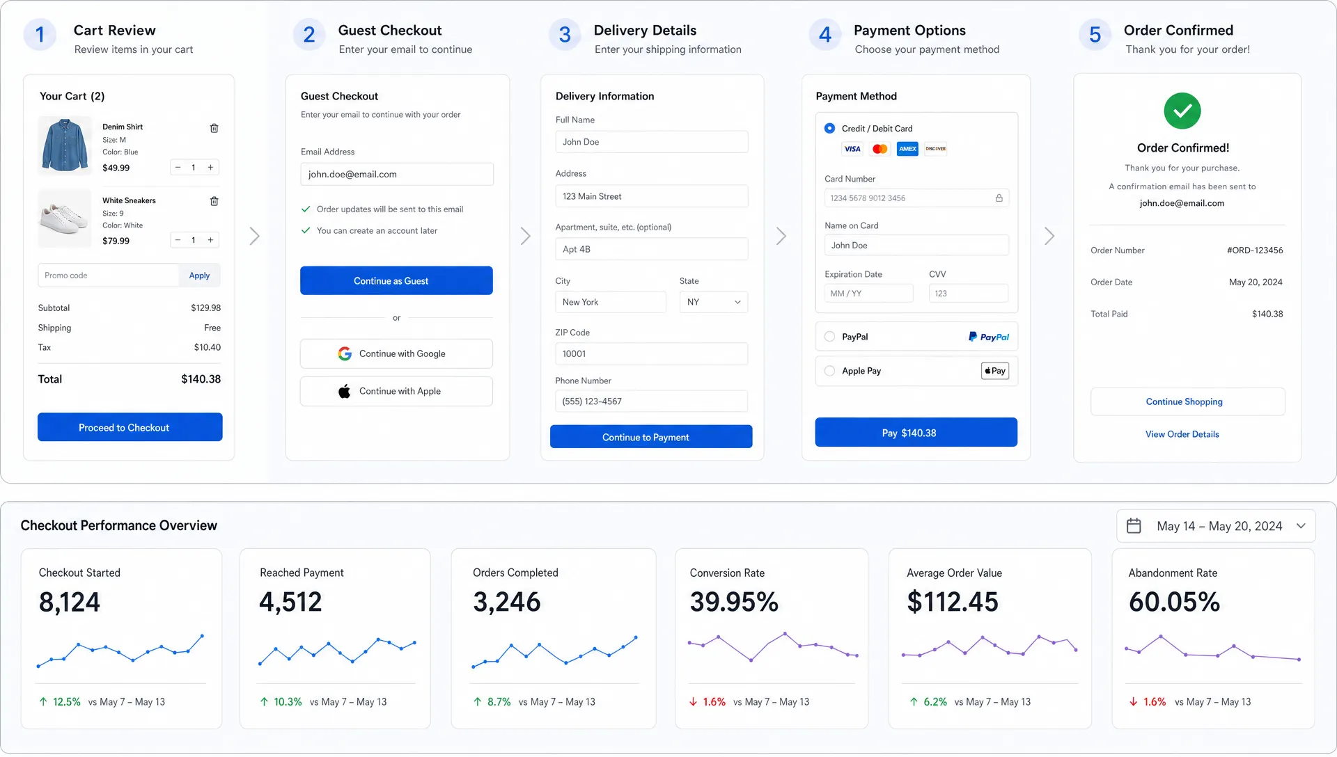
Good checkout optimisation simplifies forms while protecting operational accuracy. Guest checkout should be available unless account creation is truly required. Account prompts work better after purchase, when the value is clear and the order data is already captured.
Address lookup, input masks, real-time validation and clear error messages can also reduce abandonment. The key is to help shoppers correct issues in context instead of forcing them to scan the whole page for what went wrong.
| Checkout friction | Better approach | KPI to monitor |
|---|---|---|
| Long account creation before purchase | Offer guest checkout and post-purchase account creation | Checkout start to order completion rate |
| Late shipping cost disclosure | Show estimates in cart or early checkout | Shipping step exit rate |
| Generic payment errors | Explain the issue and offer another payment method | Payment failure recovery rate |
| Poor mobile form inputs | Use correct keyboards, autofill and address lookup | Mobile checkout completion rate |
Build trust at the exact moment customers feel risk
The closer someone gets to payment, the more risk they evaluate. They may wonder whether the item will arrive on time, whether returns are painless, whether payment is secure or whether support will help if something goes wrong.
Checkout optimisation should make reassurance visible without cluttering the interface. Short, specific trust cues near the relevant decision point work better than vague badges scattered across the page. For example, return information belongs near the order review area, delivery cutoffs belong near shipping options and payment security cues belong near the payment form.
Policy clarity matters more than decorative reassurance. “Free returns within 30 days” is more useful than a generic “Shop with confidence” message, assuming that policy is accurate. If there are exclusions, summarize them plainly and link to the full policy.
Design mobile checkout as the primary experience
For many retail brands, mobile is no longer the secondary journey. It is where shoppers discover products, compare options and often complete the purchase. A checkout that feels acceptable on desktop can still break down on a smaller screen.
Mobile-focused checkout optimisation prioritizes thumb-friendly controls, short steps, persistent order context and payment methods that reduce typing. Apple Pay, Google Pay, PayPal, Shop Pay or other relevant wallet options can help customers bypass form-heavy flows when implemented well.
Performance is part of the mobile experience too. Slow scripts, unstable layouts and delayed payment widgets can create enough friction to lose a sale. If speed issues appear across product pages, cart and checkout entry points, it may be worth addressing the underlying fixes covered in website speed optimization for conversions.
Keep the path visually focused
Checkout pages should not feel like normal browsing pages. Navigation, cross-sells and promotional modules need careful handling because they can distract from the primary goal. That does not mean stripping the experience down to something cold or generic, but the visual hierarchy should always favor completion.
A useful test is simple: if a customer returns to the page after being interrupted, can they instantly tell where they are, what is left and how to continue?
Offer payment flexibility without creating clutter
Payment preference varies by market, device and customer segment. Some shoppers want card entry, others expect wallets, installments, store credit or localized methods. Missing a preferred payment option can create avoidable abandonment, especially for mobile and cross-border shoppers.
Effective checkout optimisation balances choice with clarity. Too few options can exclude buyers, but too many poorly organized options can slow decision-making. Group methods logically, prioritize the most-used options by segment and make fallback paths obvious when a payment attempt fails.
Retail teams should also monitor payment errors separately from general checkout exits. A payment decline, gateway timeout or wallet load failure is not the same as a customer changing their mind. Treating them as one metric hides revenue that may be recoverable through technical fixes or better recovery messaging.
Measure the checkout funnel in useful detail
A single conversion rate cannot explain checkout behavior. Teams need step-level visibility into where users abandon, which devices underperform, which payment methods fail and how performance changes during peak trading periods.
Checkout optimisation becomes much more effective when analytics connect customer behavior to business impact. Track revenue lost at each step, not only session counts. Segment by traffic source, device, customer type, country, basket size and fulfillment method to see which problems matter most.
| Metric | What it reveals | Why it matters |
|---|---|---|
| Cart to checkout start rate | Whether the cart prepares shoppers to proceed | Highlights uncertainty before checkout |
| Checkout step exit rate | Where friction concentrates | Guides UX and content fixes |
| Payment authorization failure rate | Whether technical or payment issues block buyers | Separates intent loss from system failure |
| Time to complete checkout | How much effort the process requires | Useful for mobile and returning customers |
| Revenue lost by abandonment step | The commercial value of each leak | Helps prioritize roadmap decisions |
Analytics should be paired with qualitative evidence. Session recordings, support tickets, on-site surveys and usability testing can show the “why” behind the numbers. For a broader funnel view, Space Dinosaurs has also written about ecommerce conversion optimization mistakes that cost sales.
Prioritize fixes by confidence, effort and revenue exposure
Not every checkout issue deserves immediate engineering time. A rare edge case affecting a low-value segment may matter less than a confusing delivery message seen by every mobile shopper. Prioritization keeps teams focused on the changes most likely to protect revenue.
A mature checkout optimisation backlog usually includes a mix of quick UX improvements, analytics fixes, technical stability work and larger platform changes. Retailers operating on composable stacks should also consider dependencies between the storefront, payment provider, tax engine, promotion service and order management system.
| Priority signal | Example | Likely action |
|---|---|---|
| High abandonment, high traffic step | Many users exit after seeing shipping costs | Improve cost visibility earlier |
| High payment failure rate | Wallet or gateway errors spike on mobile | Investigate integrations and fallbacks |
| High customer support volume | Shoppers ask the same delivery questions | Add clearer copy near delivery selection |
| High performance volatility | Checkout slows during campaigns | Optimize scripts, monitoring and infrastructure |
The goal is not to create a perfect checkout in one release. It is to build a repeatable system for finding friction, fixing it and measuring whether the fix improved commercial outcomes.
Test changes carefully before rolling them out
Checkout tests need more discipline than low-risk content experiments. A poorly implemented test can disrupt payment, tracking or fulfillment. Before launching, confirm that analytics events fire correctly, payment methods work across devices and order data flows into downstream systems.
When testing checkout optimisation ideas, start with changes that reduce uncertainty or effort without changing business rules. Clearer delivery copy, better error messages, simplified forms and improved wallet visibility are often safer than major flow redesigns.
For higher-impact changes, use controlled experiments where possible and monitor guardrail metrics such as average order value, refund rate, payment failure rate and customer service contacts. A checkout change that increases conversion but creates fulfillment confusion may simply move the problem downstream.
Frequently Asked Questions
What is checkout optimisation? Checkout optimisation is the process of improving the cart, checkout flow, payment experience and supporting information so more shoppers complete their purchase with less friction.
Which checkout issue should retailers fix first? Start with the highest-value leak. For many retailers, that means late shipping cost disclosure, forced account creation, mobile form friction or payment failures.
Does a one-page checkout always convert better? Not always. A one-page checkout can work well if it is fast and clear, but a well-structured multi-step checkout may perform better when the order requires shipping choices, tax estimates or complex customer information.
How often should checkout performance be reviewed? Review checkout metrics continuously, with deeper audits before peak trading periods, major campaigns, platform changes or payment provider updates.
Turn checkout friction into a revenue recovery plan
Reducing cart abandonment is not about copying a generic best practice checklist. It requires a clear view of your retail customer journey, the technical systems behind it and the commercial impact of every point of friction.
Space Dinosaurs helps retail brands modernize ecommerce experiences through AI-enabled engineering, UX design, analytics and ongoing optimization. If your checkout flow is leaking revenue, start by mapping the biggest drop-offs, connecting them to customer behavior and prioritizing fixes that protect both conversion and margin.
For retail teams that want a broader roadmap, explore how Space Dinosaurs approaches AI-powered ecommerce transformation across performance, UX, analytics and scalable retail technology.